Portfolio
These are the tools I chose not to include in my project:
Voyant.
I decided when adding my text to a document to delete the source’s cover page, table of contents, references, and some details about the website that weren’t necessary in regard to the text I needed for Voyant. Otherwise, the source I found was very straightforward so I decided to leave most everything else. The Voyant tools I liked the most were Bubbles, Cirrus and DreamScape. I liked Bubbles because it really helped me to visualize the most common words/topics about Victoria Woodhull. I really liked Cirrus because it was very eye-catching and conveyed the main parts of Victoria Woodhull across very nicely. This is one I definitely want to incorporate into my project. DreamScape was an interesting feature because it mapped out location related to my text which I hadn’t really thought about highlighting. I liked this because it outlines her life- despite not being totally all-inclusive. I liked Voyant for the interactive and eye-catching aspects, but it didn’t really change my understanding of the text overall- I understood Victoria Woodhull and main details about her as well or maybe a little better from my own reading and research than if I had just plugged it into Voyant. Text mining could be really helpful for looking for a specific trend in an article or form of text. For my specific article I plugged in, it was helpful but didn’t illuminate anything new for me since I already had knowledge. I think text mining could be really useful for new documents, maybe even heavy scholarly readings if I can isolate the noise around the main text to get an understanding of a big text. I think using a tool like Voyant will be helpful for basics of finding key terms and repetitions as a first-stop on a research journey.
This is the link to my entire Voyant resource for this project.Google Earth with MapWarper
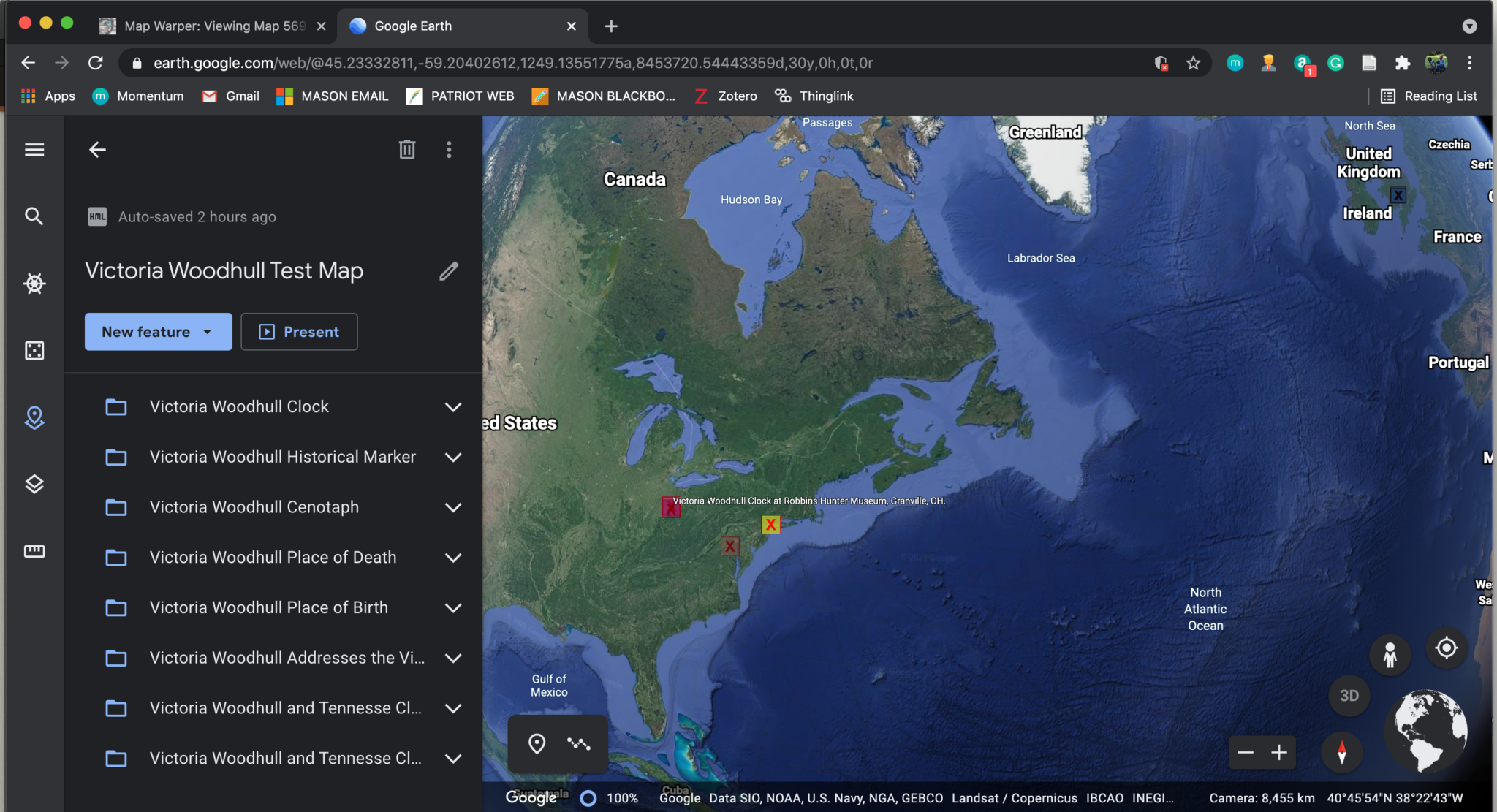
Google Earth with MapWarper was my runner up for favorite of all the map tools we used. I have a bit of a learning curve to get over understanding creating and importing an API key. In regard to the data points Dr. Beasley gave us to import on 1894-1896 UK Global Fat Supply, I found it very interesting how data could be organized in a variety of ways in the Google Map tools. I found it very interesting that data points could be organized by commodity origin as it made it very easy to see patterns in the data. Another way the data could be organized was in the form of a chronological timeline. This was based on the order the data was entered into the Excel file we uploaded. This was great for a basic chronological overview, but since there isn’t a way include more than a brief description, this would need to be a supplement to a script about a chronological history versus a stand-alone timeline. The final organizational tool in Google Maps is done by categorization by column. I also liked this approach because it easily shows where each commodity is harvested from. This is one of two contenders for the map I will use in my final project. I do think it will be really useful for my project as MapWarper allows you to overlay a historical map with modern day mapping. This will prove useful for my map since I want to include a map of historical landmarks as well as points where Victoria Woodhull made history. For my example here I have imported my Victoria Woodhull data points seen in my Google Map located on my "Visit a Victoria Woodhull Memorial page within my Exhibit.
Unfortunately I was unable to embed my Google Earth with Map Warper. I tried every tutorial online but with no luck, I chose to simply include screenshots of my Google Earth with Google Maps data points imported using a KML file and a screenshot of Google Earth with MapWarper data imported using a KML file.
StoryMapJS
StoryMapJS another service of Knightlab. Since it is related to TimelineJS, the end result very much resembled our timelines. This is unique mapping tool because it allows you to include a detailed description of your data points along with captions for images and a place for citations. I liked that you could import your own image along with each data point on the map. It was simple to search for locations or copy your own latitude and longitude points. You have the ability to alter the colors and image for your data points which is great since it makes the map much more aesthetically pleasing. This would be a great resource for someone completing a project based on the chronological history of an event as it flows nicely between map points like a traditional timeline. I am considering using this for my final project since I do have a number of chronological data points across the United States and England.
A timeline of Augustine’s history. Historical data and Web Art Gallery links were provided by Dr. Beasley.
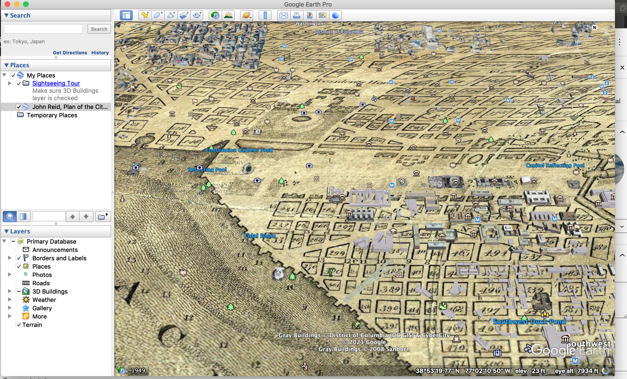
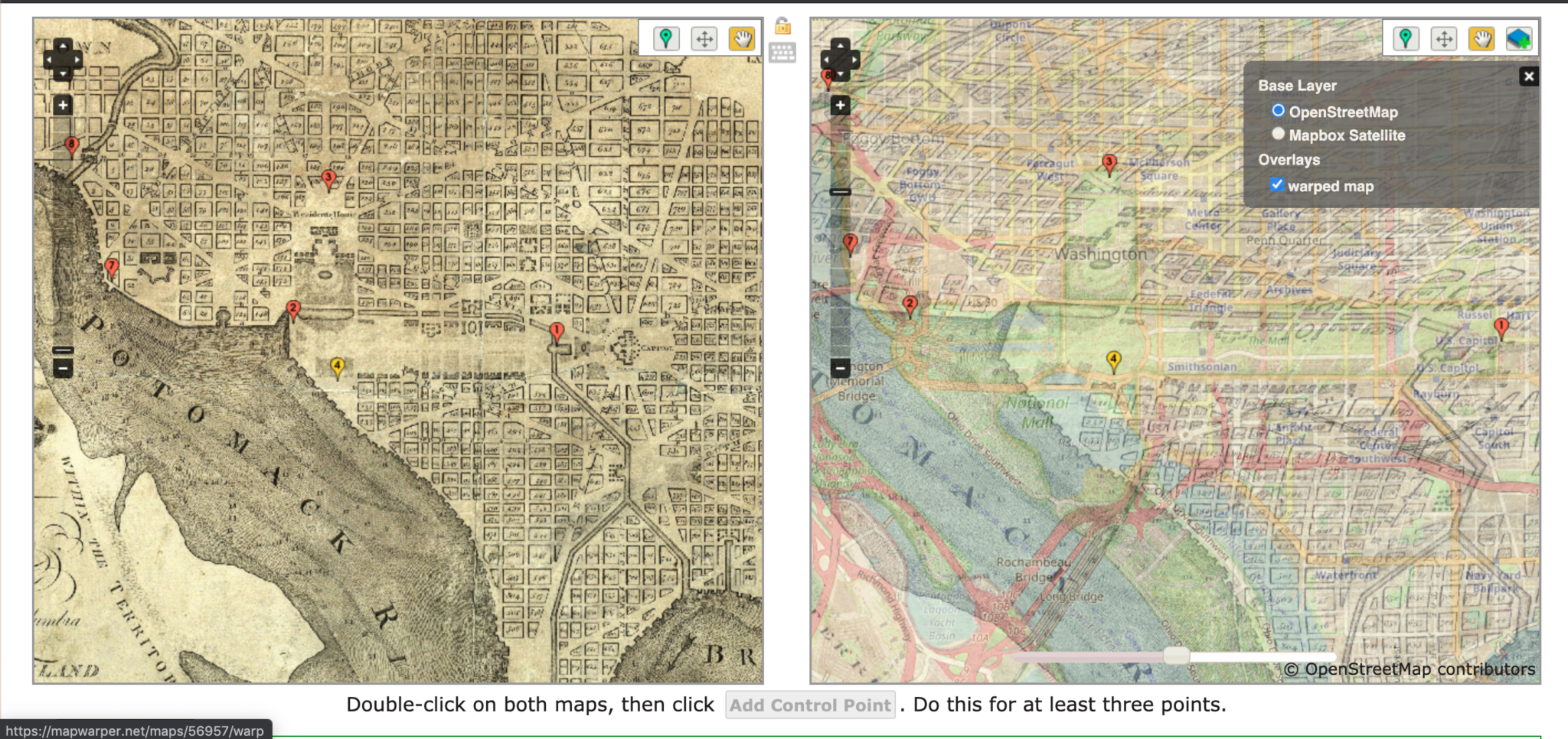
MapWarper
Unfortunately I was unable to embed my Map Warper. I tried every tutorial online but with no luck, I chose to simply include a screenshot and a share link. This is a map by John Reid, Plan of the City of Washington, 1795 was found in the David Rumsey Historical Map Collection. It is rectified over a current map of Washington DC.
 This is the link to my MapWarper for this project.
CartoDB
CartoDB is very visually appealing mapping tool. I really enjoyed the customization of the map with colors, shapes and displays of the data. I appreciated how many customization features were free to use and the user-friendly set up of the website. As someone who is not very technologically savvy but interested in mapping, I enjoyed straightforwardness of this tool. The different shapes to display the data points was particularly interesting to me, despite not really being relevant to my project. If I was doing a project that included more statistics, this would be a very valuable resource as I think heat maps are a great tool to display higher or lower frequencies of events. This, and the great deal of customization offered down to the color of your data points made CartoDB one of the most compelling map choices for me- unfortunately it isn’t relevant to my project, so I will bookmark it for future projects!
A heat map of the Amsterdam. Data set provided by Dr. Beasley.
Transcription
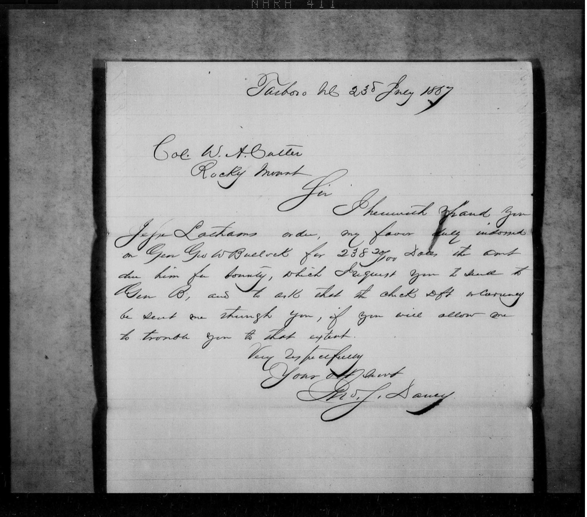
My experience with the transcription process was … fine. I didn’t find it easy, but it wasn’t impossible. Both my documents came from the Freedman’s Bureau collection on North Carolina Field Offices, Subordinate Field Offices: Rocky Mount, Letters Received, Dec. 1865–Aug. 1868, Part 2. The first document I transcribed made a lot of sense to me. I could read most of the words – or could I infer what the author was saying if I couldn’t quite read a word at first. The second document I transcribed was a little more frustrating as I understood some key words, but there were a fair number of other words I really couldn’t pick up on due to the author’s handwriting style. After completing two letters myself and passing over a number of other documents I found too hard to transcribe, I would imagine it would take years for crowdsourced transcription projects to be completed.
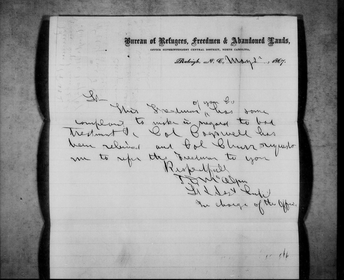 This is the link to my Freedman's Bureau Transcription.
HTML
Here is the original practice run of HTML we did early in the course. I have included screenshots for ease of viewing.
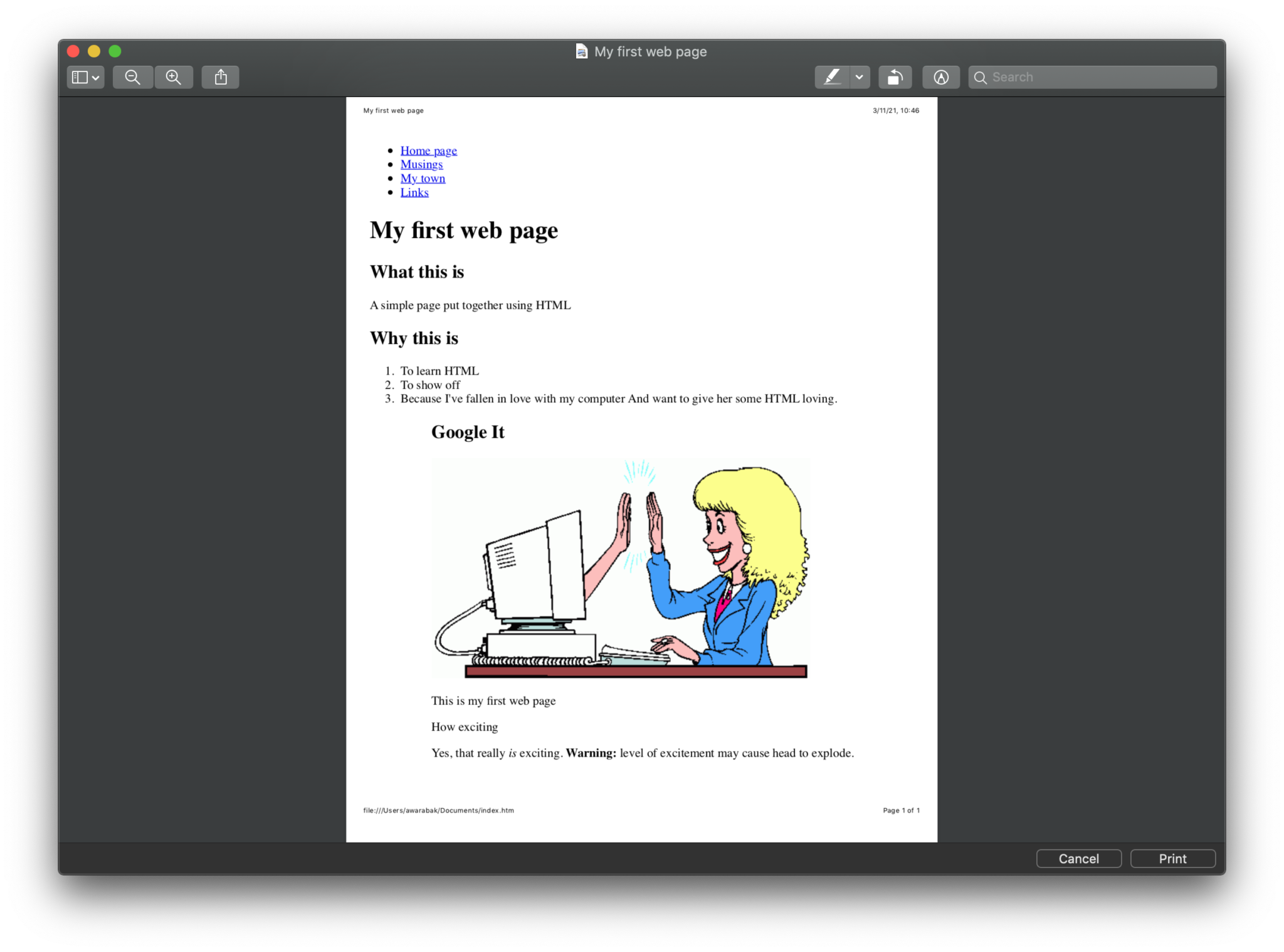
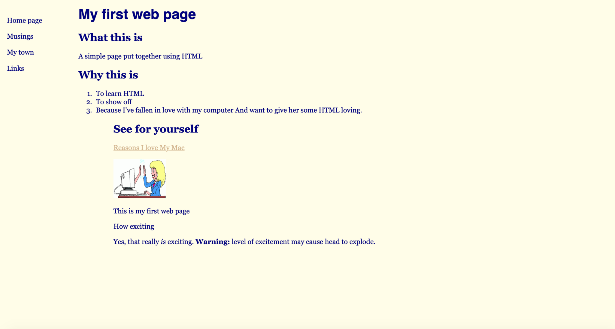
Here is the original practice run of HTML we did early in the course. I have included screenshots for ease of viewing. This very page you are on is a Simple Pages, which is written entirely in my own HMTL skills learned from the course. There is also HMTL used in various parts of my Exhibit, primarily the Home page where I used HMTL to write the script and insert the photo.
This is the link to my HMTL.