We have learned how to use a variety of different mapping tools. For the purpose of our Digital History final projects, these are going to be very useful visuals for our final projects. Below, I discuss the mapping tools we have learned how to use and give my unfettered opinion of them.
Google/Google Earth with MapWarper is my favorite of all the map tools we used. I have a bit of a learning curve to get over understanding creating and importing an API key. In regard to the data points Dr. Beasley gave us to import on 1894-1896 UK Global Fat Supply, I found it very interesting how data could be organized in a variety of ways in the Google Map tools. I found it very interesting that data points could be organized by commodity origin as it made it very easy to see patterns in the data. Another way the data could be organized was in the form of a chronological timeline. This was based on the order the data was entered into the Excel file we uploaded. This was great for a basic chronological overview, but since there isn’t a way include more than a brief description, this would need to be a supplement to a script about a chronological history versus a stand-alone timeline. The final organizational tool in Google Maps is done by categorization by column. I also liked this approach because it easily shows where each commodity is harvested from.
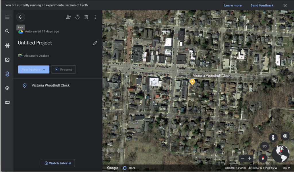
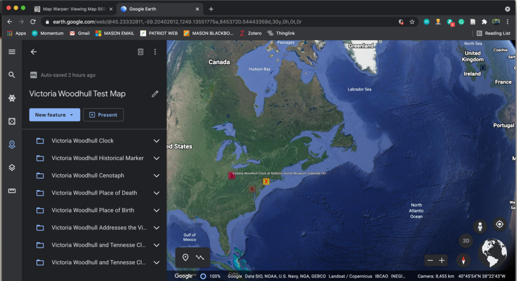
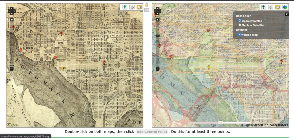
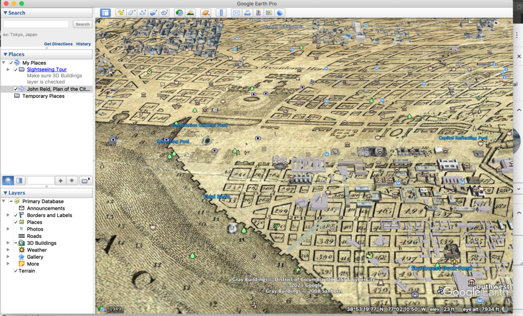
This is one of two contenders for the map I will use in my final project. I do think it will be really useful for my project as MapWarper allows you to overlay a historical map with modern day mapping. This will prove useful for my map since I want to include a map of historical landmarks as well as points where Victoria Woodhull made history.

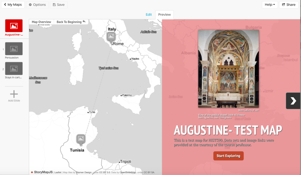
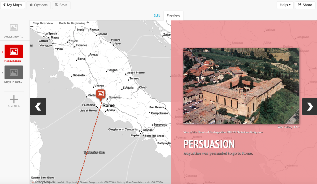
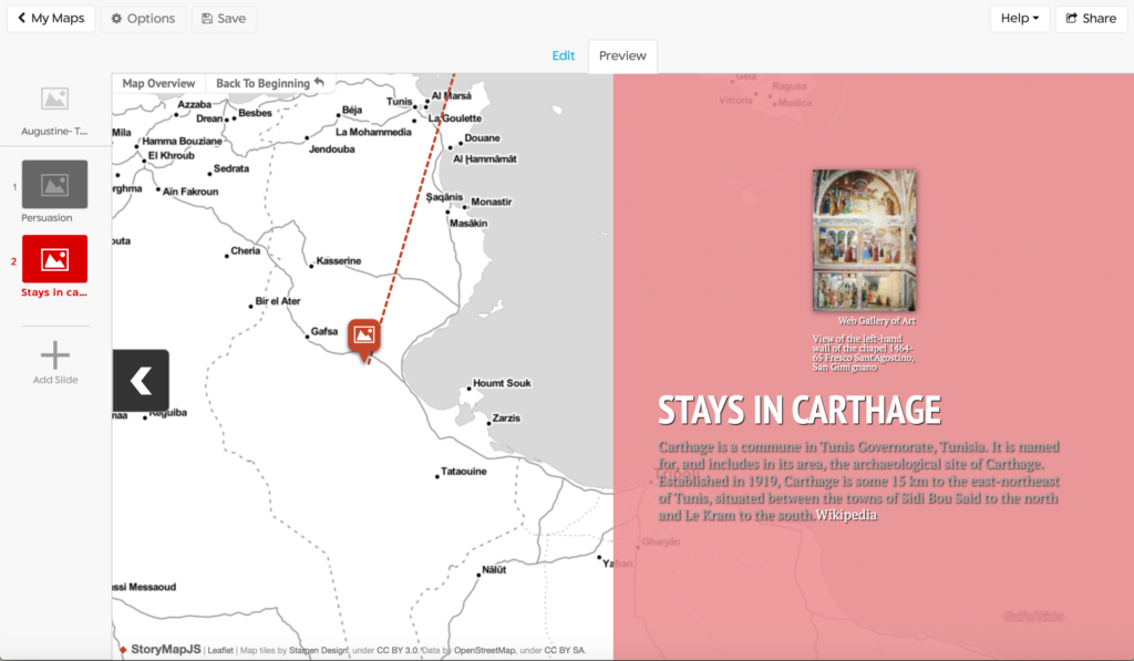
StoryMapJS another service of Knightlab. Since it is related to TimelineJS, the end result very much resembled our timelines. This is unique mapping tool because it allows you to include a detailed description of your data points along with captions for images and a place for citations. I liked that you could import your own image along with each data point on the map. It was simple to search for locations or copy your own latitude and longitude points. You have the ability to alter the colors and image for your data points which is great since it makes the map much more aesthetically pleasing. This would be a great resource for someone completing a project based on the chronological history of an event as it flows nicely between map points like a traditional timeline. I am considering using this for my final project since I do have a number of chronological data points across the United States and England.
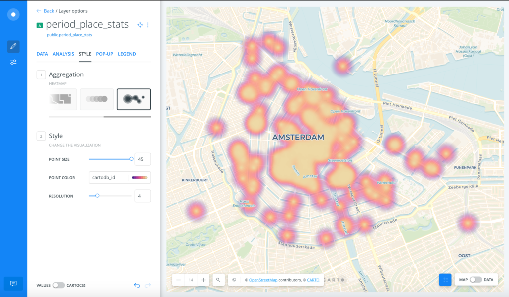
CartoDB is very visually appealing mapping tool. I really enjoyed the customization of the map with colors, shapes and displays of the data. I appreciated how many customization features were free to use and the user-friendly set up of the website. As someone who is not very technologically savvy but interested in mapping, I enjoyed straightforwardness of this tool.
The different shapes to display the data points was particularly interesting to me, despite not really being relevant to my project. If I was doing a project that included more statistics, this would be a very valuable resource as I think heat maps are a great tool to display higher or lower frequencies of events. This, and the great deal of customization offered down to the color of your data points made CartoDB one of the most compelling map choices for me- unfortunately it isn’t relevant to my project, so I will bookmark it for future projects!